The use of mobile devices has increased drastically over the past few decades, especially after smartphones hit the market. It has also led to several major changes in the online marketing industry, as nowadays mobile visitors make up a significant part of the overall traffic many websites get.
A Little Overview
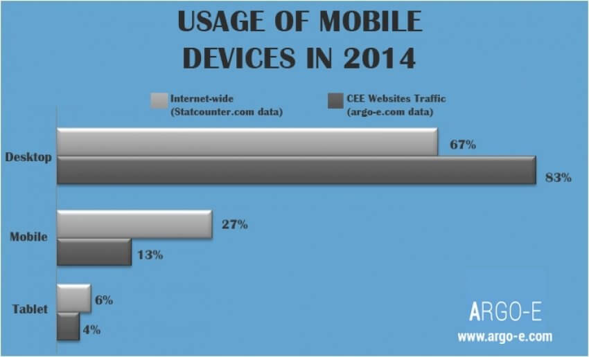
A particular survey revealed that a website gets as many as around 27% of its traffic from mobile devices. This number is way higher when it comes to countries like the USA and Brazil, where it’s considered to be well over 50%. Furthermore, these numbers are growing surprisingly quickly, meaning that mobile traffic has become more important than it has ever been.
 There’s More to It than You Think
 There’s More to It than You Think
When it comes to improving mobile user experience, most webmasters think it’s just about having a mobile version of their website. However, unless your website is an exception and a large chunk of your traffic isn’t coming from mobile devices, it isn’t going to help much.
This is especially true given that most mobile users won’t be impressed if they are made to browse a site that’s been squeezed to fit into a smaller screen. So basically, you would want them to have the same kind of experience they would while browsing the desktop version of your site.
With that being said, let’s take a look at some of the important factors you need to know about to improve mobile user experience of your site.
Having a Different Design
The design of the mobile version of your website is probably the most important factor when it comes to mobile traffic. As far as the results of Google’s research are concerned, mobile users are usually “goal-oriented”. They don’t like to jump from one page to another or do a lot of searching to find what they’re looking for.
 Similarly, they probably also hate to zoom in and pinch on tiny things, which is common with websites that have a desktop-like design squeezed into a smaller screen.
So basically, you would want to have a very simple and clean design for the mobile version of your website. Also, all the information must be easily accessible for mobile users.
In order to achieve the desired level of user-friendliness for mobile users, you would have to put in quite a bit of thinking into your mobile UX. You would need to find out what most of the mobile users on your site look for, and design the interface around those things while making them easily accessible.
Figure Out the Right Way to Use Images
As mobile devices have a much smaller screen than desktops, the content the mobile users can see on your mobile site without scrolling is very limited. That is why using images effectively may allow you to do more with less, as they can help share quite a bit of information without taking up too much space.
However, at the same time, they may also result in an increase in the page loading time, something that usually never goes well with mobile users.
That being said, there are both server-side and client-side solutions that may help you use images on the mobile version of your website effectively, without causing an increase in the loading time. Let’s take a look at those solutions below.
- On the server side, the first thing you would want to do is ensure that your host is offering timely updates, there is more than enough bandwidth, and the server speed is reasonably good. More importantly, however, the host should be capable of easily figuring out the device the visitors are using, and deliver the right type of images to the right (mobile) users.
- On the client side, the designer can actually do quite a bit as far as image optimization is concerned. Similarly, effective coding techniques with respect to delivering the images would help as well.
- Similarly, you can always make changes to the images you post to your website using a photo-editing software to make sure the image size, pixel size, resolution, and other factors make the images mobile-friendly.
- Finally, you also need to make sure that the images you post to your mobile website are impactful and don’t take up too much space or cause much clutter.
Highlighting the Call-to-Action
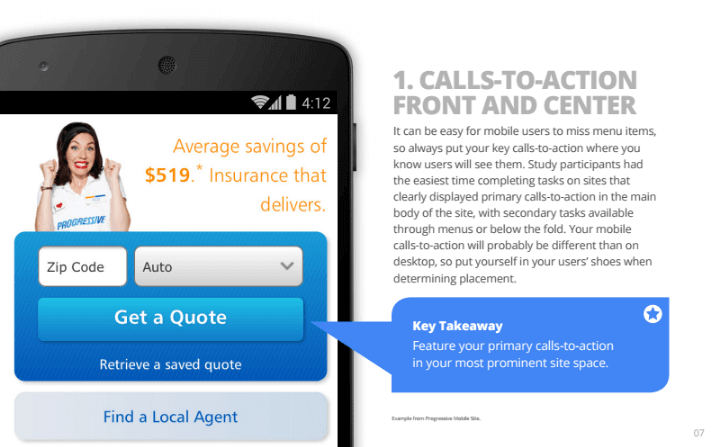 Many webmasters complain about having terrible conversion rates with mobile traffic. However, what they probably fail to realize is that mobile visitors are goal-oriented and usually in a hurry. So unless you provide them with a clear, highlighted call-to-action, you usually wouldn’t be able to make much out of them.
While it may seem a little challenging to do for a website based around a very specific service, as the visitors may be looking for more information, but it’s still always possible to highlight the most important features of your service.
It’s also recommended to put all the other items that may be considered secondary on some other page or less visible screen location.
Lengthy Forms are a Big NO
Perhaps the last thing mobile users want to do is fill out lengthier forms on a website. Hence, you would only want to have very short forms, and ask for only absolutely necessary information.
You can then contact them through the information they shared to find out more details, but asking everything on your website itself will discourage them from sharing anything with you.
You may also want to highlight the important fields and the submit button, to make the form bold and clickable enough to encourage users to fill it out.
Author Bio:
Brandon Leibowitz is a Digital Marketer with over 8 years of experience in the SEO galaxy. His content has been featured in Social Media Today, Examiner, Self Growth, e-commerce Times, Tech.co, Business2Community, and other media. You can find him on Facebook, Twitter, LinkedIn and Google+.


![What is Brand Awareness? Guide & 9 Powerful Tactics to Build It [2022]](https://brand24.com/blog/wp-content/uploads/2020/12/15-The-ultimate-guide-to-brand-awareness-1400x660x2-640x300.png)


 They are talking about your company